The Text
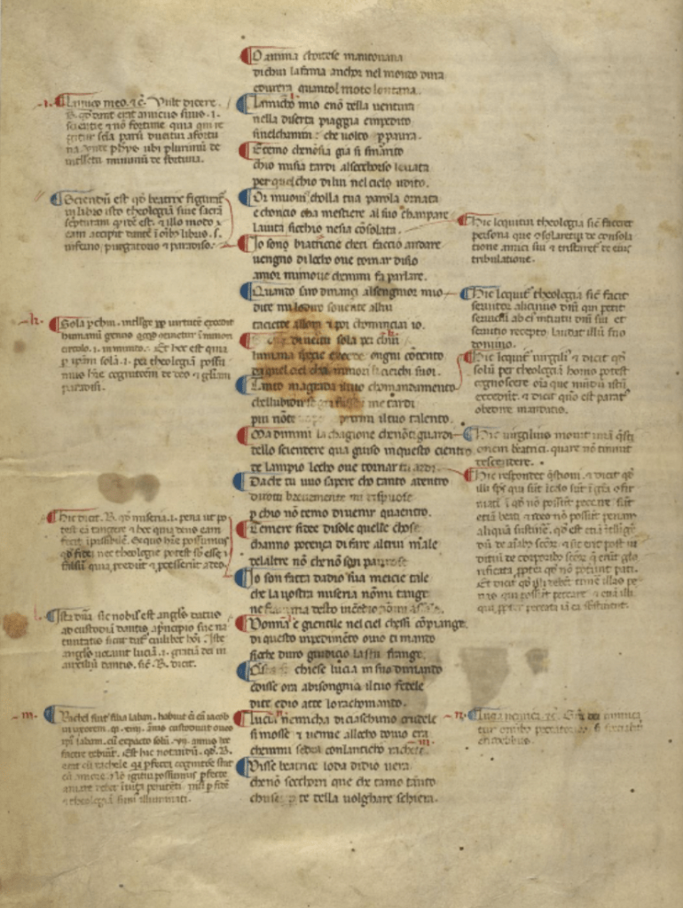
The layout of the text of the poem is “text of the Commedia,” which is one column of 48 lines. The column of text typically appears in the center of the page. Since this is a poem, it contains all of the normal elements that make up a poem, such as verses, lines, stanzas, punctuation, and rhyme scheme. The rhyme scheme of the poem is “terza rima (aba, bcb, cdc, etc.)” (Ricardo Quinones). These three-line rhymes are what make up the stanzas of this poem. Stanza breaks are indicated by paraph marks, which are pictured below in red and blue to the left of the text. In addition, the first letter of each stanza is majuscule (capitalized), and the end of each stanza has a punctuation mark called a punctus, which looks like a modern-day period. This is used to indicate a minor pause in the text. The poem is also divided into 100 cantos, with a canto being a subdivision in an epic poem. As mentioned before, this is an epic poem comprised of three sections (Inferno, Purgatorio, and Paradiso). Therefore, each section contains 33 cantos, with the exception of Inferno, which contains one more that serves as an introduction to The Divine Comedy in general (Ricardo Quinones).
Ordinatio
The term ordinatio refers to the layout of the parts of a text in a manuscript and the methods used to indicate text divisions, such as books and chapters. There are several methods used in this manuscript to help the reader understand how to move through the page.
Rubrication
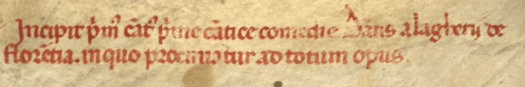
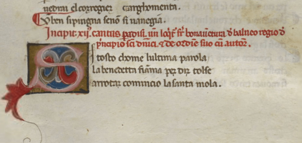
To indicate the different texts, scribes used rubrication, which refers to titles and headings introducing the new text, typically done in a red lead called minium (25). Titles and headings of medieval texts typically begin with the Latin word “Incipit,” which means “it begins/here begins” (Graham and Clemens 24). In this manuscript, the titles of each section of the poem are rubricated as well as the headings for each canto. These indicate to the reader that there is a significant transition happening in the text.
Decoration
In this manuscript, rubricated titles and headings are followed by a decoration to indicate where the next section or canto begins; usually, in the form of initials.
Initials
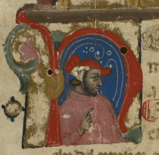
The first type of initial falls within the category of inhabited initials, which are initials that contain either a human or animal figure in it. It is called an anthropomorphic initial, which means a human figure appears in it somewhere. This specific initial pictured below is what is used to indicate the start of the first section of the poem, Inferno. The figure that appears inside of the initial is Dante because he is wearing a pink-colored robe. This is also a foliate initial because it has vine and leaf decorations that extend from it on the left side.
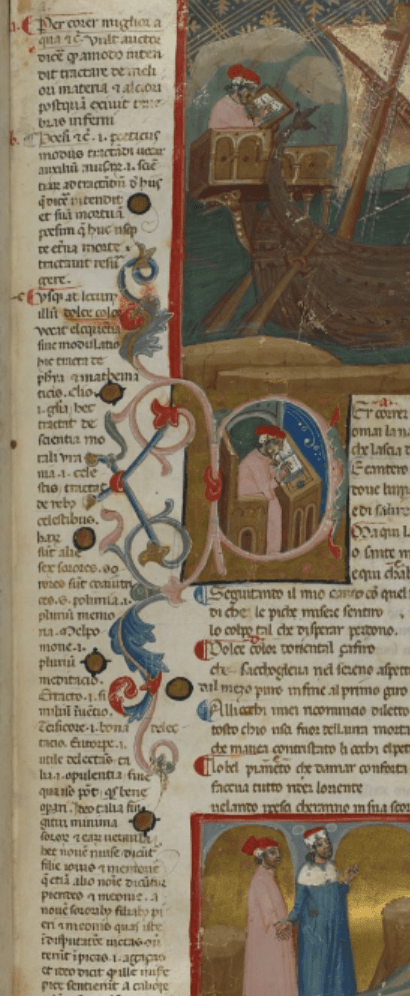
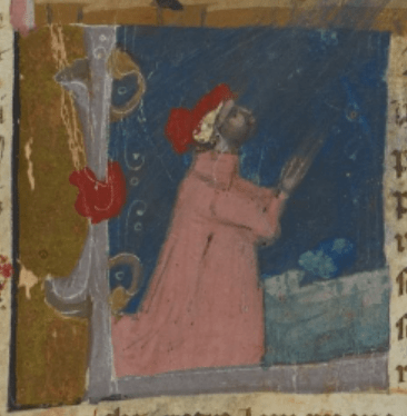
This next two initials fall within the same category, however, they are historiated initials. The difference is that these initials contain a human figure (in this case Dante) that is illustrated doing something that occurs in the text itself. The first image shows the initial that indicates the beginning of the second section of the poem, Purgatorio. Dante is presented like a typical medieval scribe, writing a book (perhaps this book) at a desk. This initial also includes foliate decoration that extends into the margins. The second image shows the initial that indicates the beginning of the third section of the poem, Paradiso. Dante is depicted in a praying position on his knees with his hands clasped together.
Now that we have some basic terminology, let’s take a look at how these elements contribute to the ordinatio.
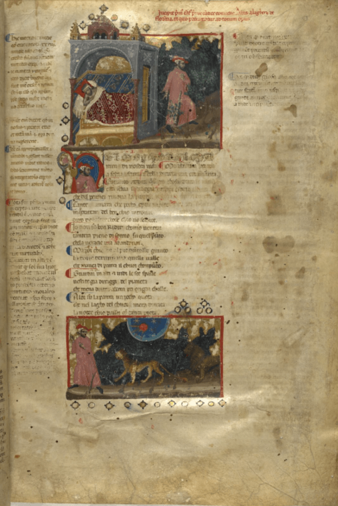
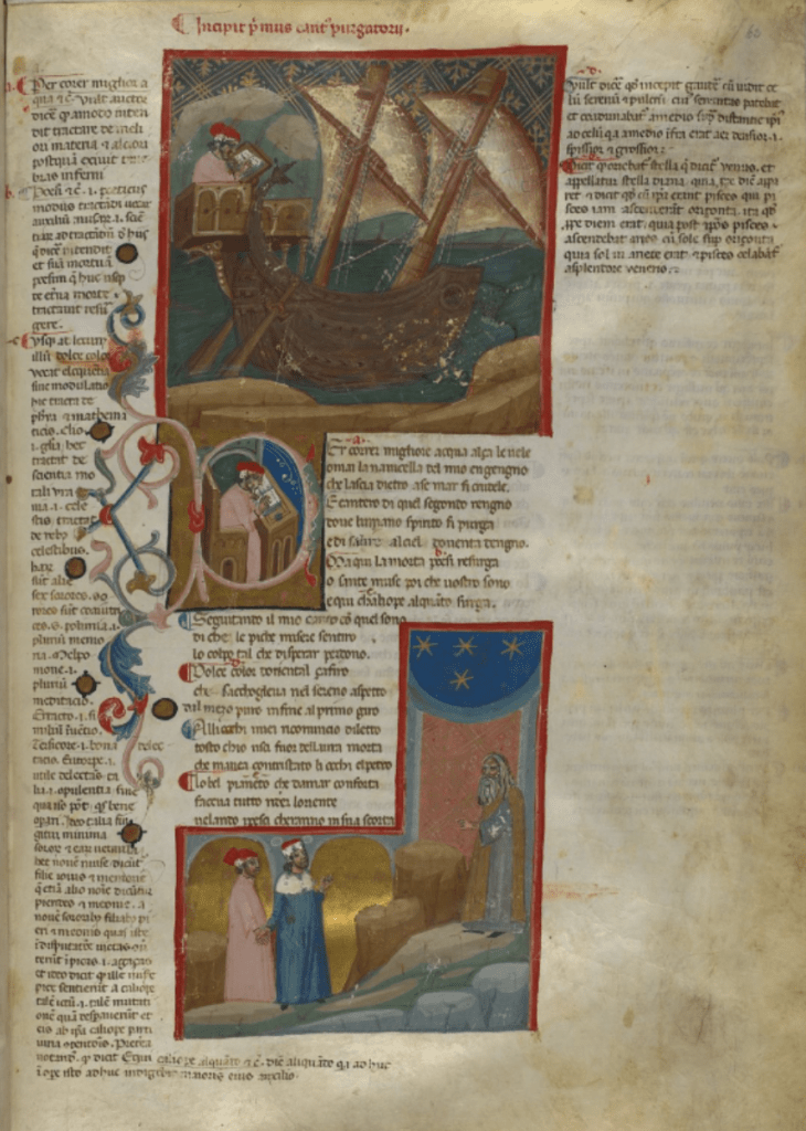
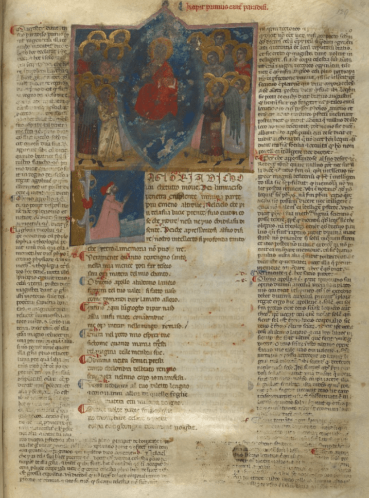
Each of these pages has rubrication appearing at the top of the page to indicate the title of the section of the poem. In addition, each also includes an illustration at the top of the page, presumably meant to introduce the opening scene of that section. Next are the inhabited initials, which indicate where the main text of the section begins. Finally, although the text layout on these pages slightly differ from the standard column, the paraph marks provide the reader with the correct order.
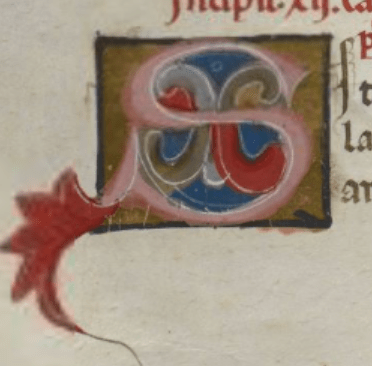
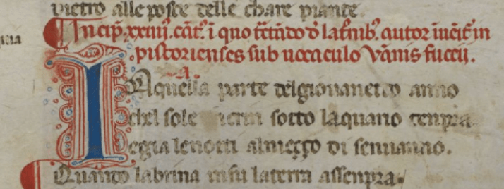
Another category of initials are decorative initials, which are initials in a text that do not have figures in them. In this manuscript, these are used to indicate the start of a new canto. The image below is one example called a pen-work initial, in this case, a littera flourisha because it is done in red and blue colors that differ from the ink of the main text. This specific letter that appears below is blue with red pen-work decoration. It is also a litterae notabiliores because it is bigger and more noticeable than others on the page.
Another example of a decorated initial is pictured below; it is also a foliate initial.